Mostrando entradas con la etiqueta Diseño Gráfico. Mostrar todas las entradas

martes, 12 de marzo de 2013

El diseño gráfico mejora el posicionamiento de las empresas


La identidad visual de una empresa es muy importante. Una empresa con una buena entrada, portada o imagen capta mejor la atención, y es la puesta de invitación a conocer los productos que allí se manejan, por eso es tan importante que el diseño gráfico como imagen corporativa de una empresa, y por eso mismo es que le llega a generar un mejor posicionamiento entre otras empresas.
Lo primero que se debe hacer a la hora de entrar en marcha el proyecto estético visual de la empresa, conocido como diseño gráfico, es estudiar su identidad corporativa en todas sus expresiones.Dentro de la identidad corporativa están; el logotipo, el slogan y la imagen. Y muchos otros elementos que vienen a nivel interior de la empresa, los anteriores descritos son externos.
Todos estos elementos quedan descritos en la imagen visual de la empresa y en todos los artículos que la integran, como por ejemplo la papelería, tarjetas de presentación, tarjetas, hojas y sobres membretados, carpetas, invitaciones y hasta uniformes.
Todo el diseño gráfico queda establecido en todos estos elementos que le darán a la empresa la imagen corporativa, lo cual logrará su reconocimiento interno y externo.Precisamente el tema de reconocimiento es el que hace que el número de clientes aumente, este aumento proporciona a la empresa un posicionamiento importante, adicional a esto y cuando la empresa es online, el tema de buscadores y SEO es también relevante dentro del reconocimiento y posicionamiento.
Una buena mezcla de colores, diseños, formas, imagen y marketing dan como resultado la fusión del diseño gráfico en el que se presenta la empresa visualmente para lograr un mejor posicionamiento.
Fuente: isopixel.net


lunes, 11 de marzo de 2013

Photoshop Touch ya está disponible para iPhone y Android


Photoshop Touch acaba de ser lanzado para el iPhone y smartphones Android.

Aunque ya existía una versión de Photoshop Touch, Adobe está vez promete una mejor experiencia para edición de imágenes con el nuevo Photoshop Touch, con algunas de las características más poderosas del Photoshop normal, como son la edición en capas, herramientas de selección más poderosas y edición de texto. Además de poder trabajar con imágenes grandes, desde un smartphone o tablet.
Somos muchos los que por cuestiones de trabajo o sólo por diversión, usamos sus dispositivos móviles para hacer edición rápida de fotografías e imágenes a través de algún dispositivo móvil. Ediciones sencillas o más o menos complejas, cuestan un poco de trabajo, si no se tiene una computadora a la mano, y más si se trata de archivos de tamaño considerable. Con Photoshop Touch, Adobe ha querido solucionar este problema lanzando su versión de Photoshop para smartphones y tablets.

Está nueva app de Adobe no se diferencia mucho de la existente para dispositivos móviles, salvo en el precio el cual es más bajo para una herramienta profesional. En tablets el precio ronda  los $10 dólares si se usa Android o iOS y en smartphones el precio es de $5 dólares en iOS y Android.
Características:
  • Mejora y edita imágenes con  las mejores características de Photoshop, como capas, herramientas de selección, filtros, ajustes tonales y de color.
  • Aplicar efectos y añadir texto gráfico.
  • Edición de imágenes tan grandes como 12 megapíxeles con capas
  • Combina imágenes rápidamente utilizando la función de selecciónScribble, y refinar fácilmente la selección con la herramienta Refinar borde.
  • Sincroniza automáticamente las imágenes a Adobe Creative Cloud  con 2 GB de almacenamiento gratuito.
Para instalar la aplicación es necesario como mínimo, en los dispositivos con iOS un iPhone 4S o un iPod Touch de quinta generación y en Android contar con Ice Cream Sandwich.


Autor: Raúl Ramírez
De: http://isopixel.net/archivo/2013/02/photoshop-touch-ya-esta-disponible-para-iphone-y-android/


sábado, 9 de marzo de 2013

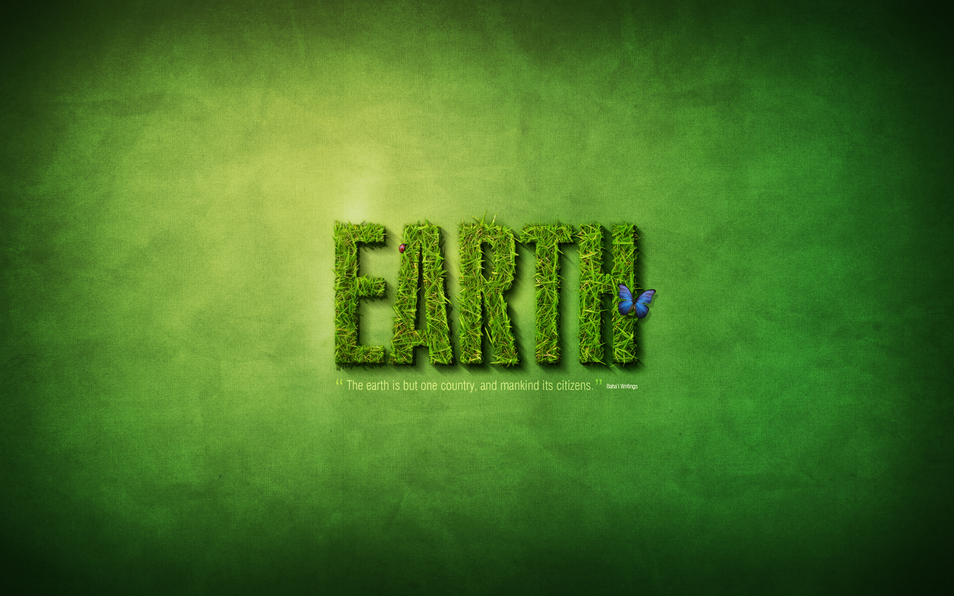
Create a Spectacular Grass Text Effect in Photoshop


Here we demonstrates how to create a spectacular grass text effect in Photoshop. Let’s get started!

Step 1

This tutorial is made up of three parts—the background, the text itself, and some final extra effects. So first of all we’re going to make a background. To do this we create a new document in Photoshop. I made mine 1920 x 1200 because I want this image to sit on my laptop background.
We start by drawing a Radial Gradient with the Gradient Tool (G) going from a light yellow-green (#adbf41) to a mid-range green (#328a26). I wonder if I’ve ever written a tutorial that doesn’t start with a radial gradient. :-)

Step 2

Now for this image we want to create a really textured background, faintly resembling paper. So the first thing we need is … a paper texture!
Happily you can grab some really awesome grungy paper textures from Bittbox and they are nice and large too, which is good because this is a huge canvas.
So I can’t remember which texture I used first, but grab one, desaturate it (Ctrl+Shift+U) and stretch it over the top to fit the canvas.

Step 3

Now we set the layer to Overlay and 70% Opacity to blend the texture with our nice green background.

Step 4

Now to get a really distressed look, I then copied this layer, spun it around 180′ and set it to 20%. Then I brought in a few more layers of paper texture (using different textures, mostly from Bittbox) and set them all to faint overlays, one on top of the other.
This was partly for the extra distress, but also because I realised that the textures looked a bit grainy and not small and sharp. So by combining extra textures and then fading it all back, I can get a nicer, sharper overall look.
Anyhow as you can see in the screenshot there are six layers here. Don’t forget if you are a Plus member you can download the PSD file for this tutorial and take a look in there yourself!

Step 5

Now I duplicated the original background gradient, placed the duplicate layer above all the textures and set it to 40% Opacity—this tones back the texture so it’s not quite so grungy!

Step 6

Now we create a new layer over the top and using a large, soft, black brush, add some black to the edges. It’s worth toning back the opacity to about 30% and Overlay. You can then duplicate the layer and run a heavy Gaussian Blur over it (set to about 32px). That way the edges really soften out.

Step 7

OK, we now have a nice background!

Step 8

OK, we are now ready to make some grass text. To do that, we’re going to need some nice pretty grass to cut. After a lot of searching, I finally found this lovely photo on Flickr of grass.
So download the image at full-size and copy it on to your canvas.

Step 9

Next we need some type. So select a font you want to cut out with. I chose Swiss 924BT, which is fat and condensed type. I thought it looked nice and grand. And I’ve written the text "EARTH". That’s because I’m making five of these wallpapers—earth, water, fire, air, spirit … it’s like that cartoon I used to watch as a kid, Captain Planet!
Anyways, so just set your text out in white and set it to Overlay and like 50% Opacity. This layer won’t actually show in the end, it’s just a guide layer.

Step 10

OK, so here’s the text on top of the grass we got earlier.
Now a bit of planning! To make text out of grass, it’s not going to be enough just to stencil out the grass. Rather we need it to look all rough, with bits of grass sticking out the edges. To do that, we’re going to use the letter shapes as a rough guide and then trace roughly around them and periodically jut out to trace around blades of grass.
I’ll warn you now, it’s very tiresome!

Step 11

OK, so here we are tracing. You should use the Pen Tool (P) and frankly, if you’re not handy with it before you start, you will be by the end!
Notice how in the parts where my path juts out, it sort of follows individual blades of grass. That way when you have the final cut-out they will look like pieces of grass sticking out.

Step 12

When you’ve finished your path, it’s best to save it in the Paths Palette. You can do this by switching to that palette and then clicking the little down arrow and choosing Save Path. That way if you need the path again later, you can grab it.
Anyhow, double-click the path to get the selection and go back to your grass layer. Duplicate the grass layer so you still have more grass for the other letters, then invert your selection (Ctrl+Shift+I) and cut away the excess grass. In the screenshot I’ve faded back the duplicate grass layer so you can see the cut out "E" part.

Step 13

OK, so here we have our "E" on the final bakcground. As you can see, it looks only slightly better than if we’d just used the letter to stencil out the grass without bothering to trace. But that’s OK, what it needs is a bit more depth. After all, if that letter was really sitting there, we should see some shadow and sides to it.

Step 14

First of all though, we’ll add some layer styling to give it a bit more of a three dimensional look. The styles are shown below.
Here’s the first set of layer styles…

Step 15

Now duplicate that layer, then clear the layer style off the duplicate, so we can add some more styles. This time add the styles shown below…
Here’s the second set of layer styles… (Note that it’s 51% Opacity so it’ll blend in with the previous layer)

Step 16

So this was all just experimental, and it kinda looks OK, but obviously has a long way to go. Now we’ll add some shadow. For that we’ll use a technique that I demonstrated in a previous tutorial, Using Light and Shade to Bring Text to Life
The idea is to make a three dimensional look. So Ctrl-click the grass layer and then in a new layer below, fill it with black. Then press the down arrow once and the right arrow once and fill it again, then repeat over and over until you get an effect like that shown. I think that was about 15 steps of filling.

Step 17

Now we run a Filter > Blur > Motion Blur on our shadow with a 45′ angle and a distance of about 30. Then set the text to a low opacity of about 50%. You should have something that looks like the screenshot below.

Step 18

Now move the shadow layer down and to the right and magic happens! All of a sudden it looks like the letter is casting a shadow. Pretty neat!

Step 19

Now I duplicated this layer three times. Each time I erased a bit of it away so that as the shadow is closer to the text it gets darker. I set these layers to Multiply.

Step 20

So this text is looking pretty cool, but for that extra bit of depth we should add some bits of grass in the background/shadow area. Rather than cutting out more grass, we can just use this current letter transformed about so that it’s not obvious that we’re hacking it together.
So as you can see below I created a few pieces of grass. They are just cut up bits of our main letter.

Step 21

Now by moving those pieces into the shadow areas, we can make it look like there is grass sticking out and it’s a real 3D object made from grass!
Because these new grass bits are in shadow, you might want to use the Burn Tool (O) to darken them appropriately.

Step 22

So yay, one letter down … four to go! Good thing we didn’t choose a long word like erm I don’t know … laborious!

Step 23

Using the exact same technique … here is the A;

Step 24

and the R and T … you get the picture.

Step 25

And finally, the whole word! The only extra thing I did here was to move the letters apart a little. Each letter is in its own Layer Group which makes moving it around much easier.

Step 26

Now nice as it’s looking, our text is a little lonely and monotonous. So in this last section we’ll add a few more elements to the design. Note we don’t want to overdo it, though, because I want this to be a desktop background, so space it is important (for all my icons!).
So first up, let’s add some extra text. Here I’ve placed a nice quote about the earth and unity taken from the Baha’i faith (that’s my religion!). I love quotes, because it means we get three parts to decorate—the quote, the quotation marks and the source.
The text is in a variation of Swiss which is thinner, but still condensed. Using multiple fonts from the same family (heavy, light, etc) is a good, safe bet for keeping your type looking coherent.
So here I’ve set the quote to Overlay and 50%, then duplicated the text and set it to Screen and 50%. Then I’ve added quotation marks in the same Swiss font, but made them extra large and a bright shade of green. Finally, the source of the quote is in teeny letters and centered vertically. And, of course, the whole quote has been measured out so it’s exactly the length of the main "EARTH" text.

Step 27

Next we’ll add a bit of a highlight to the scene. To do this, create a new layer above all the rest, and using the Gradient Tool (G), draw a gradient of white -> transparent towards the top left. Then set this layer to Soft Light and 50%. This will turn it into a nice subtle bit of lighting.

Step 28

Now we’ll add two eye-catching elements to offset all the green. These will be a brilliant blue butterfly and a little red ladybug. I used the excellent everystockphoto Web site that searches a ton of free stock Web sites for you to find two awesome images to use: Ladybug | Butterfly

Step 29

Placing the images is pretty easy. First the butterfly. We just open up the image in Photoshop, use the Magic Wand Tool (W) to select all the white area, then go to Select > Modify > Expand and expand the selection by 1px to make sure we’ve got it all. Then press Ctrl+Shift+I to invert the selection and copy the butterfly over to our main canvas.
The ladybug I selected needs to be cut out of it’s image. To do that I used the Pen Tool (P) and traced around the little guy and then just cut him out that way.

Step 30

So here are our two extras. As you can see, the lady bug looks a bit weird actually because I did a quick’n'dirty job of cutting him out. But that’s OK because he’s going to be tiny so you won’t be able to see the details anyway.
So paste them in and then shrink them down and place them appropriately. It’s best if they aren’t close together, because that way they’ll balance each other.
I added a drop shadow to each. With the ladybug it’s a very close shadow because he’s small and walking on the grass. With the butterfly, I set the distance to about 10px because he’s hovering in the air and therefore the shadow lands a little ways away.

Final Image

From:http://psd.tutsplus.com/tutorials/text-effects-tutorials/create-a-spectacular-grass-text-effect-in-photoshop/

How to Create a Stylish Wireless Phone


Final Product What You'll Be Creating

In this tutorial you will learn how to make a great looking Wireless Phone. You will be using Offset Path and various gradients to create a three dimensional phone with realistic highlights and reflections.

Step 1

Open a new document, and create a 147px by 440px rectangle. Go to Effect > Stylize > Round Corners and set the Radius to: 40px, and click OK. This will round the rectangle’s corners, straight after that go to Object > Expand Appearance and fill the shape with the color R:184 G:71 B:95.

Step 2

With the rectangle rounded rectangle still selected, go to Object > Path > Offset Path and set the Offset to: -4px, click OK and fill with Linear Gradient. To do this, open the Gradient panel: Window > Gradient (Control + F9). You need 3 gradient sliders, from left to right set the color R:98 G:100 B:99, for the second one R:203 G:222 B:210 and for the third slider select the same color you used for the first gradient slider, set the Angle to 45 and apply a Stroke Color of R:77 G:77 B:77, Weight: 1px inside.

Step 3

With the shape still selected go to Object > Path > Offset Path, set the Offset to: -2px, click OK, open the Gradient panel (Control + F9). You’ll see 3 gradient sliders. Remove one of the sliders and then on the left slider apply the color R:203 G:222 B:210 Location: 0%, on the right slider apply R:26 G:26 B:26 Location: 100% and slide the gradient slider, which is over the colors for the gradient, to Location: 14,5% and Angle: -13

Step 4

With the shape from the previous step still selected, go to Object > Path > Offset Path and set the Offset to: -2px, click OK, and change the colors for the gradient as shown in the picture below.

Step 5

Create a black rectangle with the dimensions 128px by 110px, position it as shown in the picture below.

Step 6

With the rectangle still selected, go to Object > Path > Offset Path and set the Offset to: -2px, click OK and fill it with a Linear Gradient with colors from grey to black. Take a look at the picture below for reference.

Step 7

Create a 101px by 43px rectangle and go to Effect > Stylize > Round Corners and set the Radius to: 6px, click OK. Straight after that go to Object > Expand Appearance and fill it with Linear Gradient as shown in the picture below.

Step 8

With the shape from the previous still selected, go to Object > Path > Offset path and set the Offset to: -2px, click OK, fill with the color R:202 G:178 B:146. Apply an Inner Glow by going to Effect > Stylize > Inner Glow. Enter the following settings: Mode: Normal, Opacity:75%, Blur:5px, Color #E2DFD3 (click the color square next to Mode".

Step 9

Copy the shape from Step 6 using Control + C followed by Control + F, move the copy above the other shapes by going to Object > Arrange > Bring To Front (Shift + Control + Right Square Bracket). Create a taller rectangle than the previous one, so it covers 2/3 of the previous shape, then select both shapes, open the Pathfinder panel (Shift + Control +F9) and click on the Minus Front button. Fill the new shape with white and reduce the Opacity to 20%.

Step 10

Create 30px by 15px rectangle, then go to Effect > Stylize > Round Corners and set the Radius to: 8px, click OK, then go to Object > Expand Appearance. Fill the shape with a Linear gradient from black to grey and position it as shown in the picture below.

Step 11

With the shape still selected, go to Object > Path > Offset Path and set the Offset to: -2px, click OK and fill it with black.

Step 12

Keep the object selected and, once again, go to Object > Path > Offset Path and set the Offset to: -2px and fill the new shape with a Linear Gradient from grey to dark grey.

Step 13

Regroup the shapes from Step 10, 11 and 12. Select the shapes and go to Object > Group (Control + G), copy the group you created using Control + C followed by Control + F. Move the copy a few pixels to the right, add the necessary text and icons as shown in the example below.

Step 14

Create a rounded rectangle with the dimensions 102px by 56.5px, corners 10px, fill with Linear Gradient (colors R:84 G:86 B:85 to R:30 G:32 B:31), then go to Effect > Stylize > Outer Glow. Enter the following settings: Mode: Normal, Opacity: 75%, Blur: 4px, black color, click OK. Position the shape as shown in the picture below.

Step 15

Copy the shape from the previous step, change the color to black and delete the Outer Glow effect. To do this, open the Appearance panel (Windows > Appearance, or Shift + F6) and drag the "Outer Glow" layer into the delete bin.

Step 16

In the center of the shape from the previous step, Create 71px by 71px circle with the Ellipse tool (L), select both shapes, open the Pathfinder panel (Shift + Control + F9) and click on the Minus Front button.

Step 17

Create a rectangle over the shapes from the previous step, select the shapes (from the previous step and the rectangle), open the Pathfinder panel and click on the Divide button. Delete the surplus shapes as shown in the picture below.

Step 18

Select the group that appeared in the previous step, go to Object > Path > Offset Path and set the Offset to: -2px, click OK and fill the shapes with a Linear Gradient from grey to black.

Step 19

With the shapes still selected, go to Object > Path > Offset Path and set the Offset to: -2px, click OK and fill with the color R:200 G:203 B:211.

Step 20

Create a black 50px by 50px circle with the Ellipse tool (L), copy the circle using Control + C followed by Control + F, turn off the Fill Color, apply a 1px Stroke, the color doesn’t matter because we’ll fill it with Linear Gradient. With the shape still selected, go to Object > Expand and fill with Linear Gradient with colors R:51 G:51 B:51 to R:203 G:222 B:210.

Step 21

Select the circle from the previous step and go to Object > Path > Offset Path and set the Offset to: -4px, click OK and fill the shape with Linear Gradient with colors R:84 G:86 B:85 to R:30 G:32 B:31.

Step 22

With the shape still selected go to Object > Path > Offset Path and set the Offset to -1px, click OK and fill the shape with a Radial Gradient with colors from black to R:51 G:51 B:51.

Step 23

Add the necessary button icons in any way you desire, take a look at the picture below for reference.

Step 24

Create a 30px by 24px rectangle and go to Effect > Stylize > Round Corners, set the Radius to: 10px, click OK. Go to Object > Expand Appearance and fill the shape with Linear Gradient with colors from R:30 G:32 B:31 to R:84 G:86 B:85, finally apply a black 0.5px Stroke.

Step 25

With the shape still selected, go to Object > Path > Offset Path and set the Radius to: -2px, click OK, turn off the Stroke Color, open the Gradient panel and click on the Reverse Gradient button.

Step 26

With the Offset shape still selected,go to Object > Path > Offset Path and set the Radius to : -1px, click OK, fill it with black and once again go to Object > Path > Offset Path, and set the Radius to: -1px, click OK. Fill the shape with Linear Gradient with colors from R:84 G:86 B:85 to R:30 G:32 B:31

Step 27

Group the shapes from Step 24, 25, 26 and 27. To do this, select the shapes and go to Object > Group, then select the group and go to Effect > Distort & Transform > Transform, enter the following settings: Copies: 2 Move, Horizontal: 35px, leave the other values as default, click OK. After that go to Effect > Distort & Transform > Transform. Click on the Apply New Effect button and enter the following settings: Copies: 3 Move, Vertical: -27px, click OK.

Step 28

Add the necessary letters and numbers over the buttons.

Step 29

In a position above the display, create an ellipse with the dimensions 81px by 43px and color #282A29, then go to Object > Create Gradient Mesh, enter the following settings: Rows: 4, Columns: 5, click OK. Correct the points and the color as shown in the picture below.

Step 30

Create a black 51px by 27px ellipse and position it in the center of the previous shape.

Step 31

With the ellipse still selected, go to Object > Path > Offset Path, set the Radius to: -1px, click OK. Fill the shape with a Linear Gradient with colors from R:98 G:100 B:99 to R:30 G:32 B:31. Finally add 3 black circles as shown in the picture below.

Step 32

Select all of the shapes and go to Object > Group.

Step 33

Lock the phone group or turn it off by clicking on the eye in front of the group. Create a 288px by 237px rectangle and go to Effect > Stylize > Round Corners and set the Radius to: 80px, click OK and go to Object > Expand Appearance. After that create another rectangle, this time wider than the previous one (shown in the picture below). Select both shapes, open the Pathfinder panel and click on the Minus Front button, correct the key points as shown in the example.

Step 34

Fill the last shape you created with Linear Gradient. To do this, open the Gradient panel (Window > Gradient or Ctrl+F9). You need 3 Gradient sliders. From left to right apply the color R:123 G:27 B:42, R:125 G:28 B:43 and R:87 G:28 B:43. Create two shapes over the previous one using the Pen tool (P), fill them with a Linear Gradient from white 100% to white 0%, apply a 25px Gausian Blur. Select the shape from the previous step, copy it using Control + C followed by Control + F, move it over the shapes you just created. Select the newly created shapes and the shape you moved them over and go to Object > Clipping Mask > Make (Control + 7).

Step 35

Create an ellipse over the previous shape and fill it with a Linear Gradient as shown in the example below.

Step 36

Copy the ellipse using Control + C followed by Control + F, move it a few pixels up, change the gradient to Radial with colors from grey to black, apply a Drop Shadow (Effect > Stylize > Drop Shadow) and enter the following settings: Mode: Normal, Opacity:50%, X Offset 0px Y Offset: 5px, Color: 6D6D6D.

Step 37

Create a white ellipse and position it as shown in the picture below, apply a 25px Gausian Blur and reduce the Opacity to 70%.

Step 38

Over all the other shapes, create a black ellipse Select all the shapes and group them by going to Object > Group. Have a look at the picture below for reference.

Step 39

Make phone visible again and position it over the the group you created earlier.

Step 40

With the Pen tool (P), create a black shape to cover the bottom part of the phone.

Step 41

Select the phone group and the shape created in the previous step and open the Transparency panel. In the top right corner you’ll see an arrow, click on it, from the drop down menu select Make Opacity Mask. This will make the entire phone disappear, but we need to hide only the bottom part, so with the Transparency panel open, un-check Clip. This way only the bottom part of the phone will be hidden.

Step 42

With the phone group still selected (and the Transparency panel still open), click once on the mask window. This way we can apply a Gasian Blur to the mask layer only. After you’ve selected the mask layer, go to Effect > Blur > Gausian Blur and set the Radius to: 14px, click OK. You’re now finished!

Conclusion

To finish your illustration add a background, I’ve chosen a complimentary light blue. There you have it, a stylish Wireless Phone.
From: http://vector.tutsplus.com/tutorials/illustration/how-to-create-a-stylish-wireless-phone/